A Christmas Card for the Season
People ask about my work process all the time. Here is a practical example of how I tackle a project.
Creating a card for the Christmas season is something I enjoy. This year I had specific goals: The card had to 1) stand on its own, 2) fit on a standard sheet of card stock. 3) Include references to love, acceptance, hope, the future, and World Peace. (One must include World Peace.)
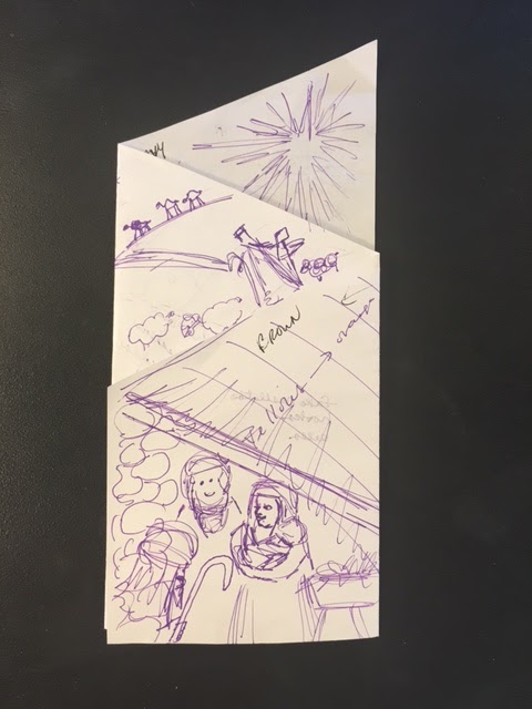
It began with a humble piece of paper and a purple Pilot pen. I chose the characters necessary to portray my themes: the Holy family, shepherds, traveling wise men, rainbow, light in darkness, palm branches and a donkey, a trumpeting angel. I suppose I could have crammed in more, but with these, I was satisfied.
I knew I wanted the action on different panels and viewable, at least in part, at the same time. That meant I had to Dexter the top of the card at an angle. The Star of Bethlehem had to be a constant presence on both sides. That would require at least two folds. I had been thinking about this card for weeks so I had a pretty good idea where things needed to go. I carried the sketch around with me for several days and would take it out and scratch on it when I would think of something and then like a school kid I'd unceremoniously cram it back into my pocket.
 |
| A self-standing, folded card |
 |
| Measuring 3.75 inches x 8.5 inches, this baby fits in a regular envelope. |
Satisfied with my doodles, I worked in the figures as silhouettes. That allowed me to evaluate placement and negative spaces without wasting time on drawing details at the development stage—a luxury I never get at year-closing anyway. At that point I could see what needed to be removed: a kneeling shepherd boy was crowding Mary, an ornate doorway had nothing to do with a manger scene OR the holy family's refugee residence in Egypt, and the extraneous sheep had to go.
 |
| Black and white shapes are easy to evaluate. |
Then the actual illustration began with a mechanical pencil. I prefer a #2 pencil but my constant pencil sharpening drives Jim bananas. Color was added with graphic marker in one fell swoop, not in layers like I prefer (Again, time was not on my side). The art was scanned and printed from my $99 Canon. I folded and trimmed it. Unfortunately, the color came out as "Oh, Happy Day!" which certainly did not match my mood (2016 was the Stinker of Years). I decided to go darker—much darker—and finally I was satisfied.
 |
| If only I felt as happy as this card looks. |
 |
| There we go. That feels more grounded. |
 |
| Ironically, the back is my favorite side. |
I could very well have stopped at the silhouette stage for a dramatic result, and I may develop a commercial card along those lines, but for this year, I wanted it to look hand drawn instead of the slick stuff I do for work. Cards were printed locally by Graphic Resource and were mailed to family and close friends.
Now, on to the next project.
Comments
Post a Comment